
F&I Product Management App
Replacing a costly tool with a streamlined internal solution.
Overview
I led the end-to-end design of a new internal application, replacing the outdated tool with a streamlined in-house solution that improved usability and efficiency, while aligning with the design system.
Objective
- Develop an in-house solution that supports the F&I team’s core tasks
- Integrate the design system (Sequoia)
- Reduce vendor costs

Prototype walkthrough of the new F&I Product Management app.
Approach
As Senior Product Designer, I led the effort to replace the third-party tool with a streamlined, scalable in-house application. My approach combined systems thinking with close cross-functional collaboration to ensure the solution was not only user-friendly, but also technically feasible and aligned with Lithia’s Sequoia Design System.
I began with a deep dive into the existing tool, auditing its architecture and conducting interviews and usability sessions with the F&I Operations team. These insights guided early low-fidelity concepts that explored multiple approaches, which I validated with stakeholders before moving forward.
From there, I translated the findings into a simplified design system–driven solution, balancing Sequoia components with Kendo’s data grid library. This required partnering closely with engineering to navigate technical constraints while maintaining visual and functional consistency. Throughout the process, I worked alongside my PM, design manager, and design system lead to align on scope, prioritize key features, and ensure the tool delivered business impact.
Details
My Role
Senior Product Designer
Company
Lithia Motors
Team
Design, Product, & Engineering
Duration
3 months
Devices
Desktop, Tablet, & Mobile

Previous third-party tool
Research & Planning
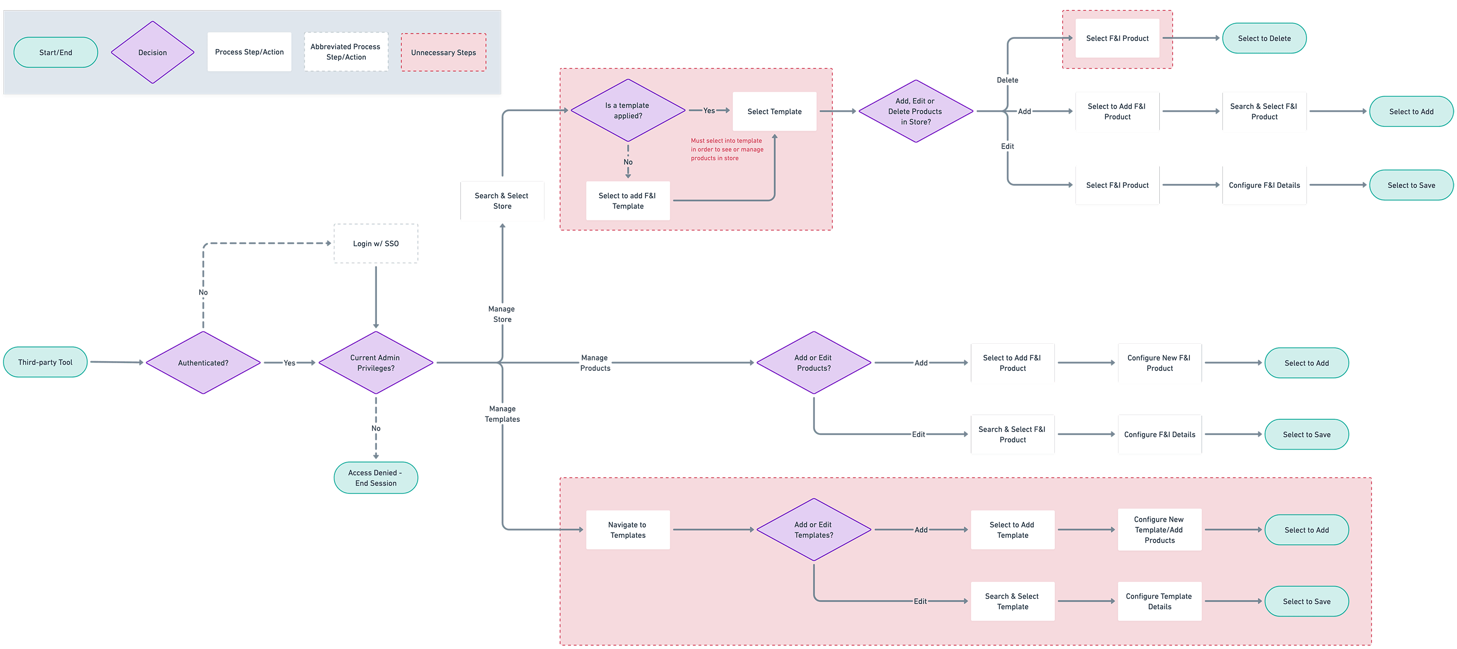
As I began work on the project, it became clear that the existing third-party tool was not just costly—it was actively hindering the F&I team’s workflow. Dense data grids were buried behind multi-column forms, unrelated content was permanently fixed to the UI, and key actions were scattered without clear context. The interface lacked hierarchy, making it overwhelming to navigate and frustrating to use.
Through early interviews and usability testing, one issue stood out above the rest: the use of templates. Users were required to create a template, assign products to it, and then apply it to a dealership—adding unnecessary steps to an already cluttered experience.
This approach made it difficult to surface product information quickly or make one-off edits to a single dealership, revealing the system was far more complex than it needed to be.
Key Insight:
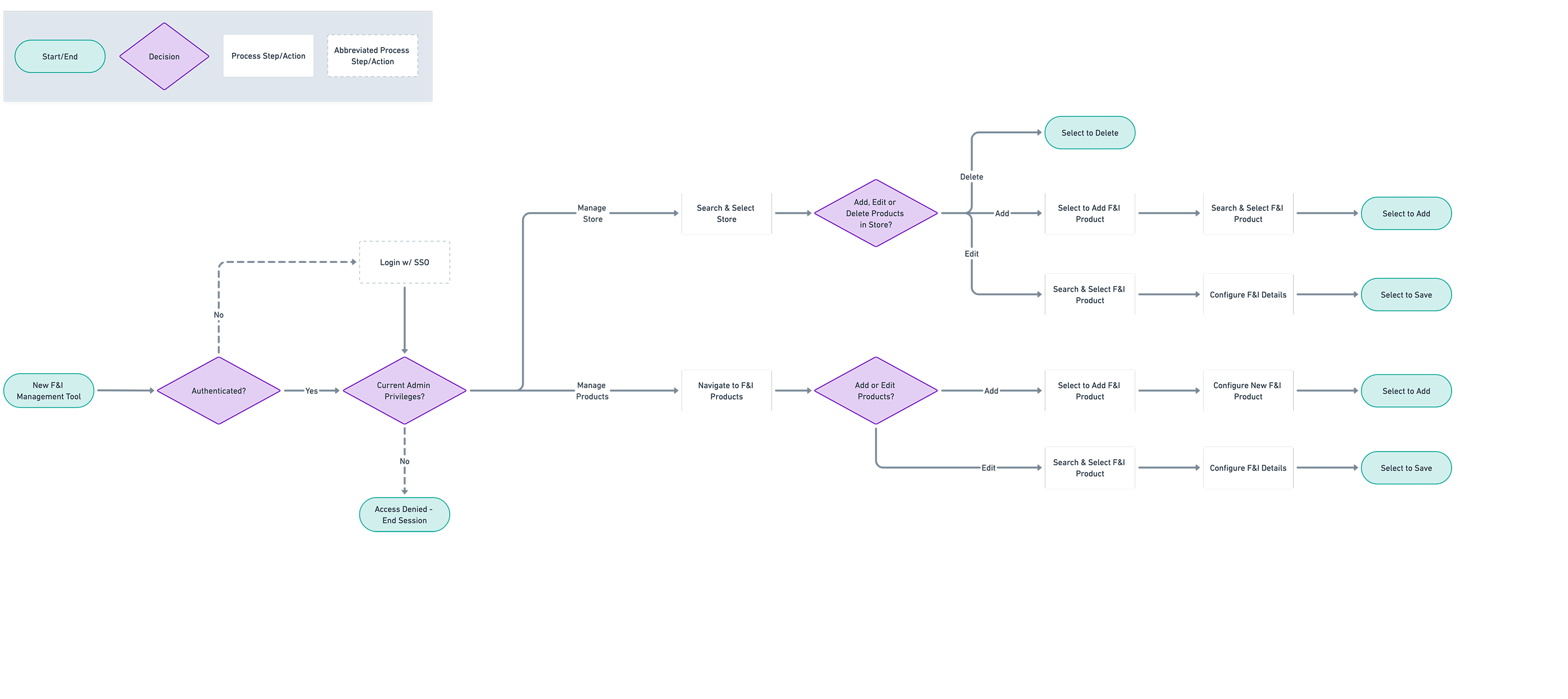
By removing templates, we could simplify the experience, reduce friction, and minimize development scope without sacrificing functionality. This shift allowed us to focus the app around two core tasks:
- Create & manage products
- Map products to dealerships
User Flows & Wireframes
With simplified tasks and updated user flows in place, I moved into early design exploration using low-fidelity wireframes and prototypes. These helped validate functionality and layout with stakeholders before investing in detailed UI. Early feedback from stakeholders confirmed that the proposed approach not only met their needs but significantly improved clarity and usability.
Key design decisions:
- Introduced product categories to replace templates, enabling easier bulk actions and more intuitive filtering.
- Surfaced product information directly within dealership views for quick edits without deep navigation.


Design
With alignment across Product, Engineering, and Design, I transitioned into high-fidelity design. This phase required more detailed thinking and collaboration, especially around implementation. The company’s internal tools had never utilized our Sequoia Design System before, so integrating it for the first time was a critical step.
I worked closely with engineering to understand the technical constraints of our environment. Where Sequoia lacked certain patterns (like advanced table behavior), I prioritized immediate usability while documenting a backlog of enhancements for future design system expansion.
By the end of this phase, we had a polished, design-system-compliant solution that engineering could confidently begin building.


Handoff & Collaboration
Using Figma’s Dev Mode, I created detailed specs for each screen at both desktop and mobile breakpoints. These included annotations for happy paths, edge cases, and logic details around interactions, bulk actions, and category mapping.
To support engineers, I:
- Added component-level annotations for interaction states and behavior
- Documented complex flows with diagrams showing UI states and connections
- Hosted a live walkthrough of the full experience and opened the floor for questions
This collaborative handoff process minimized ambiguity and enabled a smoother build with fewer blockers.

Outcome & Impact
The new app significantly reduced user workload and eliminated unnecessary complexity. Removing templates saved time and clicks, and surfacing products directly in dealership views created a much smoother editing experience.
Business impact:
- $108K annual savings by eliminating the third-party tool
- Early user feedback was overwhelmingly positive with the F&I team calling the new experience a major upgrade
- Leadership praised the design as the “best internal tool” experience to date
- Sequoia’s design system made its internal tools debut, setting a new standard in the apps space.
Despite some late-stage challenges—like introducing support for multiple instances of the same product, and balancing design system integration with legacy data grid components—we prioritized key updates, created a manageable backlog, and stayed agile through last-minute requirements.
In the end, this was more than just a redesign—it was a step forward in modernizing internal systems, proving the value of thoughtful UX, and setting a new bar for internal tooling at Lithia.